What makes for good mobile app design?
Or, more accurately, what types of things grab our attention when we’re using mobile apps?
Aalto University in Finland recently conducted a study regarding mobile app design, and the results regarding what grabs attention and what doesn’t may surprise you.
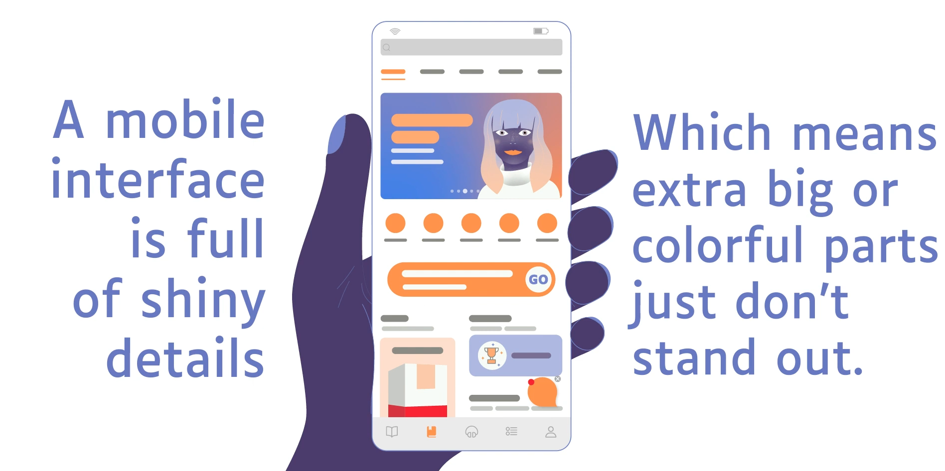
Researchers in the study used a number of different mobile interfaces with eye tracking to see how users look at and respond to apps on different devices. Most surprising of all? Despite what you’d expect, bigger or brighter elements did not actually attract more attention as you might expect. On mobile devices in the study, neither of these elements impacted how users viewed them.
Some design principles did hold true, however. Users’ eyes tended to drift to the top-left corner of apps first; text was critical on users’ first view of an app; and images draw attention frequently, even if they aren’t large. Color and motion do help attract attention, too. Overall, however, the design composition of the overall app is much more important to drawing attention than any one bright or large element is.
Researcher Luis Leiva may have said it best in the report when he stated that “when everything is made to stand out, nothing pops out in the end.”
Put another way, because mobile apps have smaller interfaces than desktop web pages, etc., space is at a premium. Designers too often rely on traditional cues (e.g. make this button big or colorful to attract attention) in their apps, and often, in an effort to make everything look important, nothing ends up standing out.
The full Aalto study and conference paper contain far more information for anyone curious about the in-the-weeds details that researchers uncovered. Still, we think the overall message that “bigger and brighter is not always better” is interesting, especially since it runs contrary to what many have assumed for a long time to be true about mobile app design.
The moral of the story? The overall design composition of your app is far more important than single elements, especially since you’re dealing with such limited real estate. We hope to see more research in this previously unstudied area in the coming years. We can imagine that it will only grow more difficult to hold users’ attention the more we all get glued to our phones!
—
Photo credit: Aalto University via YouTube
